
TropicalSensors — brand identity + landing page
A sensor company that growers trust on first look.
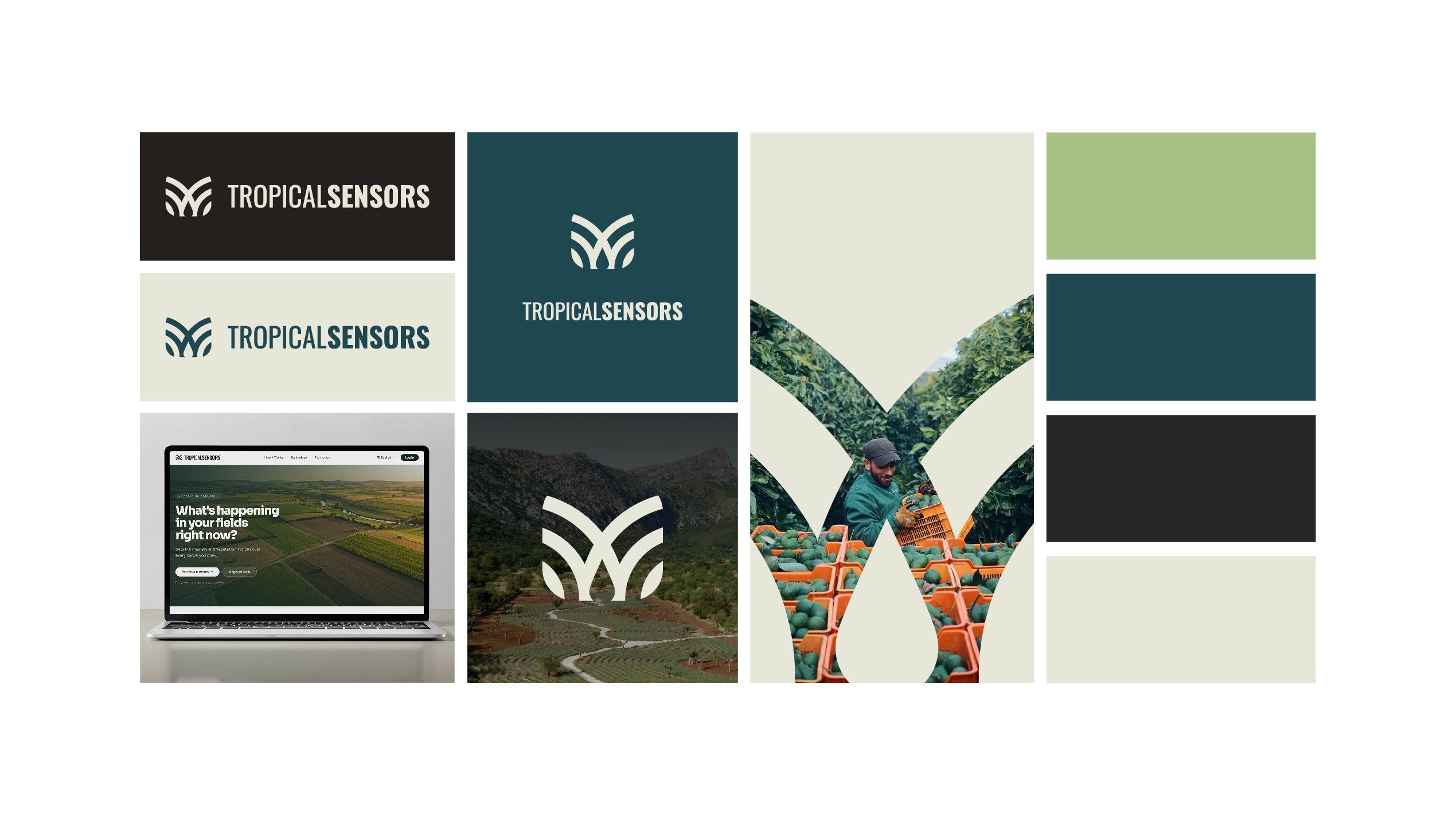
Brand identity and landing page for TropicalSensors, an agritech IoT startup that monitors soil moisture and crop indicators in real time. From zero to launch-ready in 3 weeks.
At a glance
- Client
- TropicalSensors, agricultural IoT startup
- Services
- logo system, color palette, typography, tone of voice, landing page design
- My role
- lead designer, from brief to final files
- Timeline
- 3 weeks
- Starting point
- no logo, no brand, no site
- Live site
- tropicalsensors.com
The challenge
TropicalSensors had a working product: sensors in the field that track soil moisture and crop indicators in real time. What it didn't have was a face. No logo, no visual identity, no website.
Their audience is growers, not tech buyers. A grower needs to understand what the product does for their crop in a few seconds, and needs to trust a young company with something as important as their harvest. The brief: a brand and a one-page site that explain the product quickly and feel trustworthy from day one.
What I decided, and why
-
Start from the field, not from the tech.
The greens and teals and the typography are drawn from the fields the sensors live in. Most IoT brands look like dashboards. Growers should recognize their own world first, and see the technology second.
-
A logo system, not just a logo.
The mark is built around a leaf symbol and works on dark and light backgrounds and over field photography. A hardware startup shows up in many places at once: the site, devices, presentations, social. One mark had to hold up everywhere from the first day.
-
A landing page that opens with the grower's question.
The page doesn't open with the company or the technology. It opens with the first question a grower asks, then answers in the order a grower thinks: what it measures, how you see the data, why you can trust it, how to start.
-
A tone of voice to match.
Plain, practical words a grower uses, not engineering jargon. If a farmer has to reread a sentence, the sentence is wrong.
Starting point
There was nothing before: no logo, no colors, no site. Everything on this page was built from a blank brief in 3 weeks.
Result
A cohesive identity and a clear site the team could launch with. In the founder's words, the results "exceeded all my expectations."
What the client said
“I highly recommend Valeriia for any design project. I hired her to create the complete branding and a landing page design for TROPICALSENSORS, and the results exceeded all my expectations. She perfectly captured our vision, translating it into a beautiful, cohesive visual identity. She is exceptionally talented.”
Building something real that doesn't look it yet?
Send me your site link and I'll tell you what I'd fix first.