
MOJI Focus Studio — rebrand from IKIGAI
A new name deserves a look that matches it.
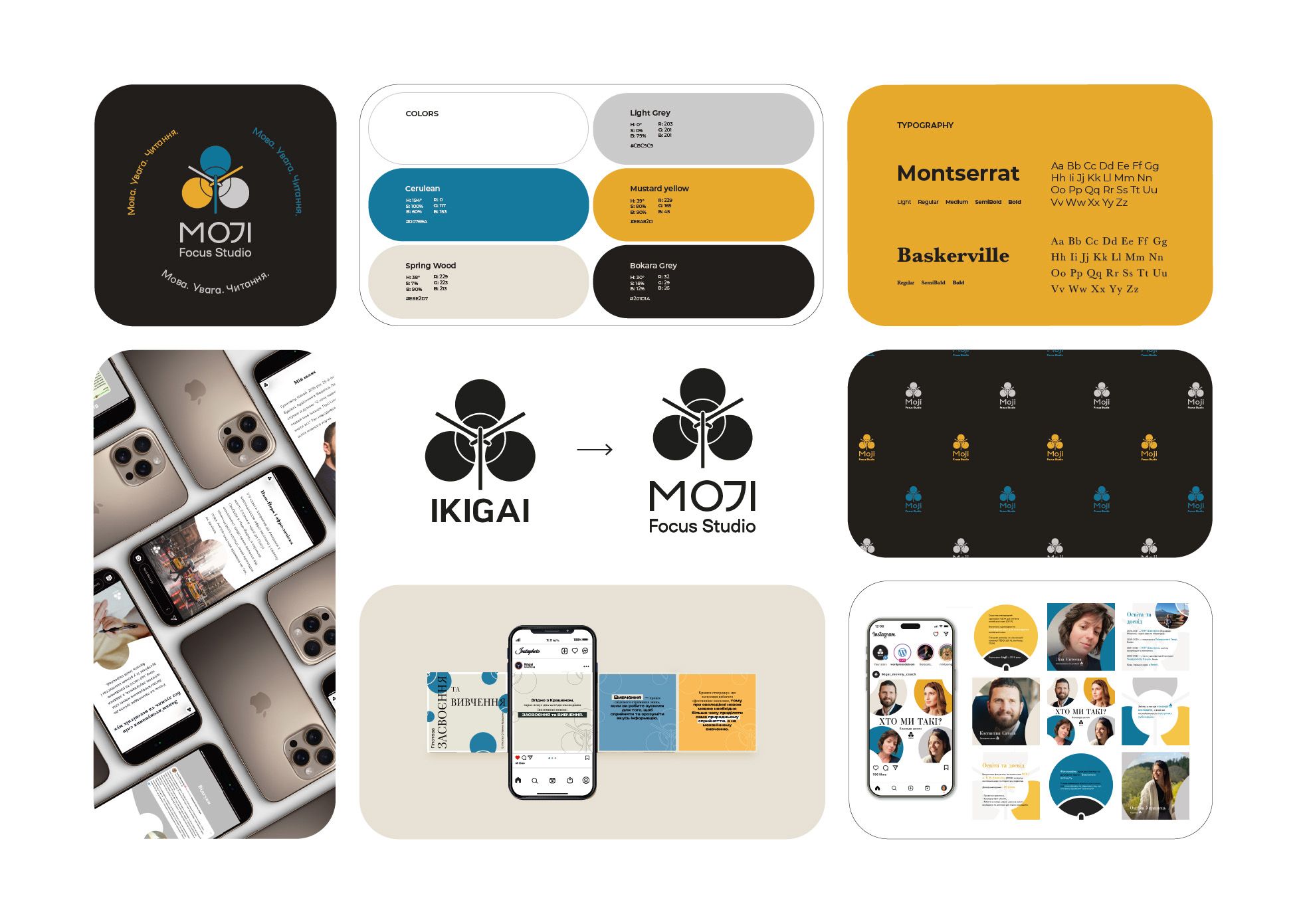
Full rebrand of an education studio, from IKIGAI to MOJI Focus Studio: logo, palette, typography, pattern, and a visual system for social, print and packaging. Done in 2 weeks.
At a glance
- Client
- MOJI Focus Studio (formerly IKIGAI), education
- Services
- logo, color palette, typography, brand pattern, social media system, posters, packaging, print
- My role
- lead designer
- Timeline
- 2 weeks
The challenge
The studio changed its name from IKIGAI to MOJI Focus Studio. A new name on an old look sends mixed signals: people who knew IKIGAI don't connect the dots, and new people see something that doesn't feel finished.
The studio needed one identity that works everywhere it shows up: on social media, on posters, on packaging and in print. And it needed it fast, so the new name wouldn't live for months without a face.
What I decided, and why
-
A palette with focus and warmth.
Blue, mustard and beige. Blue carries the "focus" in the name: calm, clear, easy to concentrate around. Mustard adds energy, so it never feels like a textbook. Beige keeps everything warm and human, which matters for a place where people come to learn.
-
Two typefaces with two jobs.
Montserrat for headings and everyday use: clean, modern, readable on a phone. Baskerville for accents: a classic book serif that brings a sense of learning and care. Together they say "modern studio" and "serious about education" at the same time.
-
A brand pattern that works without the logo.
On social media and packaging the logo is often small or missing. The pattern makes a post, a poster or a box recognizable as MOJI at a glance, even before anyone reads the name.
-
A system, not a set of files.
Templates and rules for social media, posters, packaging and print, so the studio can keep the look consistent on its own after handover.
Before / after
IKIGAI → MOJI: the old logo next to the new one, old posts next to new ones.
Result
A more memorable, consistent identity. The studio became more recognizable on social media, and the new look helped it attract new clients.
Changed your name, or outgrown your look?
Let's find the character and make it visible.